


Why Do You Need a Responsive Website?
Most likely you have experienced the annoyance of trying to navigate a website on your phone that isn’t responsive. It simply doesn’t work well at all.
Web traffic from mobile devices has grown to an average of 3-5% of all web browsing. It can jump to 50% and higher, depending on your target audience, when it comes from email marketing campaigns and social media. This is of course due to the volume of people now interacting with email and social on their phones and tablets. Just take a look at the latest Comscore report on mobile growth and you know these numbers are just going to continue to increase.
With these types of growth numbers and the poor experience of standard websites on smartphones, it’s critical to rethink strategies for the mobile visitor, otherwise, sales will be lost.
Three Routes to Mobile Content
- Mobile only focused site – some sites,especially largeness sites choose to make a standalone site for mobile visitors. When a mobile device is detected, it automatically takes the person to the mobile site. The advantage of this is that you have more control over the looking feel for the visitor than a responsive site. The downside is that it can be expensive to develop and maintain a mobile only site unless you have a good content management system in place.
- Standalone App – Some companies have made a standalone mobile app that you can download from the AppStore strictly for consuming content from that company rather than visiting the website. The advantage of this is that you can create an amazing experience with an app, but it can be extremely costly to build and maintain. Additionally that app has to be heavily promoted in order to get a sizable audience.
- Responsive design – methodology of web design that alters the page automatically to the screen resolution the visitor is using. In most cases it shrinks image size and moves or hides lower priority items on a page. The goal is to improve readability of the main content. The benefit of this is that any page made will be able to be easily read on any type of device at any orientation and still look good.
If you use a content platform like WordPress or one of the open source CMS, it may be a simple matter of just changing to one of the newer themes hat have been published recently. On any other platform, you’ll need to make a number of changes to modify your existing design, but it is well worth it. Start by studying frameworks such as Skeleton to get started with responsive design if you’re doing it from scratch.
Impact of Responsive Design
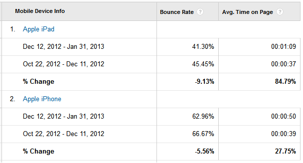
Responsive websites, when viewed from a mobile device, especially from smartphones, on average have a 30% improvement in conversion rates over non-responsive designs. That is a pretty big improvement. Even visitor engagement can be vastly improved. Below is a chart that shows a time period before and after a responsive framework was added to the site.
Its common sense that a better user experience, like responsive designs, will drive more conversions. Assuming its a good design, visitors will be able to find what they want easier, stay on the site longer and have a much greater chance at converting. This is especially true for smaller e-commerce websites where the shopping experience is vastly improved with a responsive design that is tailored to the target platform.
With an increasing number of mobile devices and their level of sophistication, the importance of providing a good experience to this audience is becoming critical to doing business online.

