
Increasing Mobile Engagement with Responsive Design
 The North Pointe Church (NPC) is a small but growing church in the Tampa, Florida area. Like most small church websites, theirs is mostly used for telling visitors about themselves, events in the community and answering questions about Christ.
The Issues
The web team was manually managing their content, graphics and video without any publishing tools. The church was growing fast enough that they couldn’t keep up with the constant updates to information. They needed to adapt faster to the changing needs of their members and the community and manual updates limited to just the web team took too long and too many resources.
WordPress is is commonly used by churches because it is simple to use by even non-technical staff and its free. But they knew they needed the ability to stay on top of mobile trends. Over 20% of their website visitors were coming from some type of mobile (tablet and phone) device.
So NPC chose a WordPress theme that was responsive. A responsive website is one that adjust the position of site elements and text so that it looks good on any mobile device or desktop screen. Another advantage is that responsive websites also show better form conversion rates. If you use your phone to visit most websites, you’ll most likely have to zoom in, but a responsive website adapts so that visitors don’t have to do this. It is a much better experience for visitors.
The Mobile Results of Responsive Design
Once deployed, repeat visits to the website started increasing and people were staying on the website longer. Overall, there was a 53% growth in unique mobile visitors to the website over the same time period the previous year. But more importantly, there was an increase in engagement.
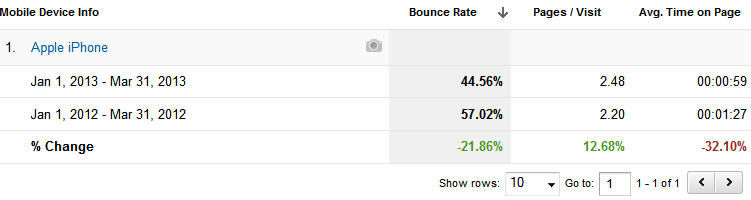
For the iPhone, you can see that the bounce rate significant improved and people visited more pages. The Average Time on Page decreased, which is normally a bad thing, but in this case, people are not spending their time pinching and moving the screen around to find what they are wanting, so this turns out to be a great metric as well.
Give the site a try from your tablet and phone to see how the overall layout adapts to the device you are using and judge for yourself if it is a better experience.