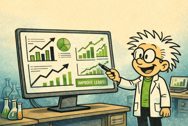
Your website is pulling traffic. Maybe decent traffic. But visitors keep leaving without buying, signing up, or even reaching out, and you can’t figure out why. Here’s the thing: the answer usually isn’t buried in your analytics. It’s staring back at you from your own homepage. Messaging that’s too vague. A next step that’s too hard to find. A value proposition that makes perfect sense to you but leaves your visitor scratching their head. OpenAI and Anthropic’s Claude are two of the most visited websites on the planet, and they face this exact challenge at an almost incomprehensible scale, turning millions of curious visitors into paying subscribers every month. Both companies are almost certainly using their own AI tools to test and refine their approach, which makes them a rare kind of case study: real-world, high-stakes, and constantly optimized. Here’s what a close look at both homepages reveals, and more importantly, what it means for your own site.
That is what makes this comparison worth more than a simple design critique. These are two of the most visible AI brands in the world, and both are trying to move people from interest to engagement, from engagement to signup, and from signup to paid usage. Yet they do not take the same path. One leans hard into immediate interaction. The other appears more focused on clarity, structure, and reducing friction. Studying those differences reveals something useful for any business with a homepage, especially businesses that get traffic but are not seeing enough leads, demos, booked calls, or sales.
Watch the Video Breakdown
This is a conversion critique, not a style review. The real questions are whether the message is clear, whether the value is easy to understand, whether the page creates momentum, and whether the next step feels obvious. When those pieces are in place, conversion gets easier. When they are not, even strong brands can leave opportunity on the table.
Why This Comparison Matters
Most businesses think they have a traffic problem when what they really have is a clarity problem. A homepage can look polished and still underperform if visitors have to work too hard to understand what is being offered, who it is for, or what they should do next. That is why homepage performance matters so much. In a matter of seconds, a visitor is trying to answer a short list of questions. What is this? Can it help? Is it relevant? What happens next?
If a homepage answers those questions quickly, the visitor stays engaged. If it does not, the visitor leaves, often without much thought. People rarely abandon a website because they carefully decided against it. More often, they drift away because the page created uncertainty, and uncertainty kills momentum.
That is what makes this side-by-side look at Claude and OpenAI so valuable. These are not small brands trying to figure out how to look legitimate. These are major platforms with enormous reach, and even they make different tradeoffs between clarity, engagement, and conversion flow. One leans heavily into immediate interaction. The other appears more focused on reducing friction and making the path forward easier to understand.
The Conversion Story Starts Before the Homepage
One of the more interesting observations showed up before the homepage even entered the picture. OpenAI appeared easier to discover through search for common use cases. Searches around tasks like creating emails with AI or building software with AI tended to surface OpenAI more naturally, while Claude was harder to find consistently.
That matters because conversion does not begin the moment someone lands on a homepage. It begins earlier, when a person starts looking for a solution. If a company is easier to find during that discovery phase, it has already created an advantage. More visibility means more opportunities to enter the decision process first.
To be fair, neither brand depends on search in the same way a typical business does. Both benefit from strong brand awareness, direct traffic, and constant public attention. Still, discoverability shapes the top of the funnel. When one platform is easier to find, it gets more chances to make the first impression.
OpenAI’s Homepage: Brilliant Entry, Murky Next Step
Step onto the OpenAI homepage, and the first thing that greets you is a simple, open-ended prompt field: What can I help with?
It’s worth pausing on that for a second, because it’s a genuinely clever solution to one of the hardest problems in marketing. How do you communicate value when your product does a hundred different things for a hundred different kinds of people? Most websites try to solve this by listing features, or by picking one audience and hoping the others feel included. OpenAI sidesteps the problem entirely. Instead of telling visitors what the product does, it invites them to discover it themselves. Type in a question, get an answer, and watch the product sell itself through experience rather than description.
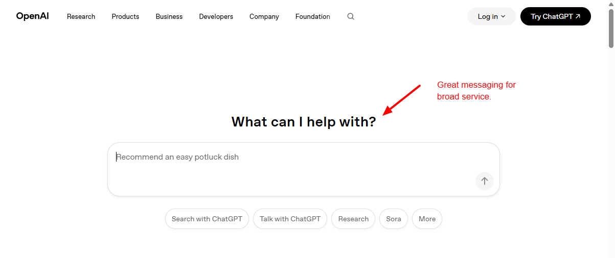 That works. The visitor isn’t reading about AI, they’re using it. Engagement happens instantly, and in conversion optimization, engagement is everything. The longer someone interacts with your product or content, the more likely they are to take the next step.
But here’s where OpenAI stumbles: what is the next step? After a visitor has played around with the chat interface and is genuinely curious about signing up, the path forward gets murky. There’s no prominent navigation guiding them forward.
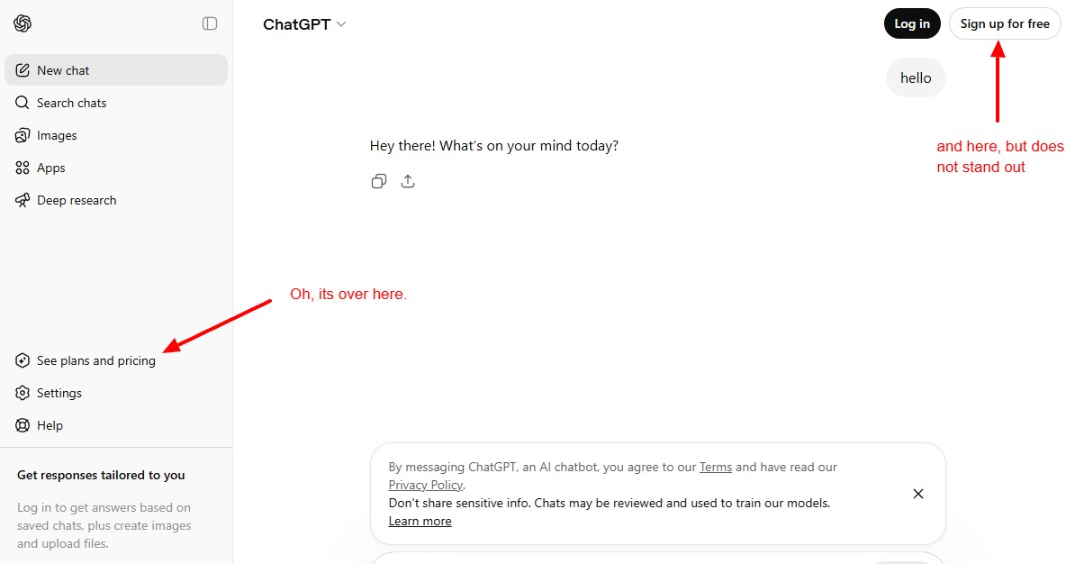
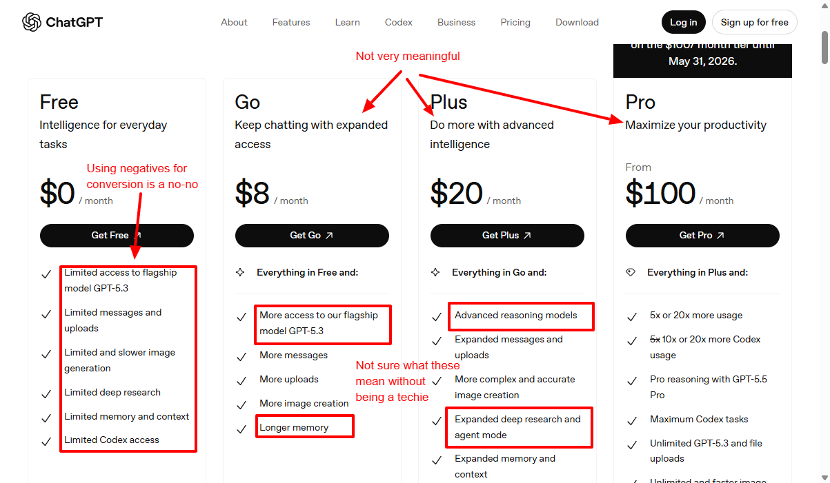
Pricing isn’t front and center; it has to be hunted down. And once you find it, the language used to describe the plan tiers creates a whole new problem.
“Limited access to flagship model GPT-4.” “Deep research.” “Codex.” For a technical audience, these terms land. For a business owner, a freelancer, or anyone who isn’t already fluent in AI product vocabulary, they read like a foreign language. When visitors feel confused, they leave. The pricing tiers do improve as you move up, with language like “expanded,” “advanced,” “unlimited,” and “maximum” creating a sense of escalating value. But the free tier description does the opposite of what it should. Instead of building excitement about what someone will get, it leads with what they won’t get. Limited this. Slow that. Restrictions and caveats where there should be curiosity and momentum.
 The lesson from OpenAI’s homepage is a split one: their entry point is exceptional, but the conversion path after that initial spark is harder than it needs to be.
Claude’s Homepage: Cleaner Language, Stronger Capture
Claude’s homepage takes a different approach, and in several ways, a smarter one.
The moment a visitor lands, they’re presented with a sign-up prompt. No friction, no hunting around. The page doesn’t make a big production of the word “free,” but the implication is clear, and the call to action is right there at the top. Compare this to OpenAI’s homepage, which makes no real attempt to capture visitor information at the front door. Claude is building its list from first contact.
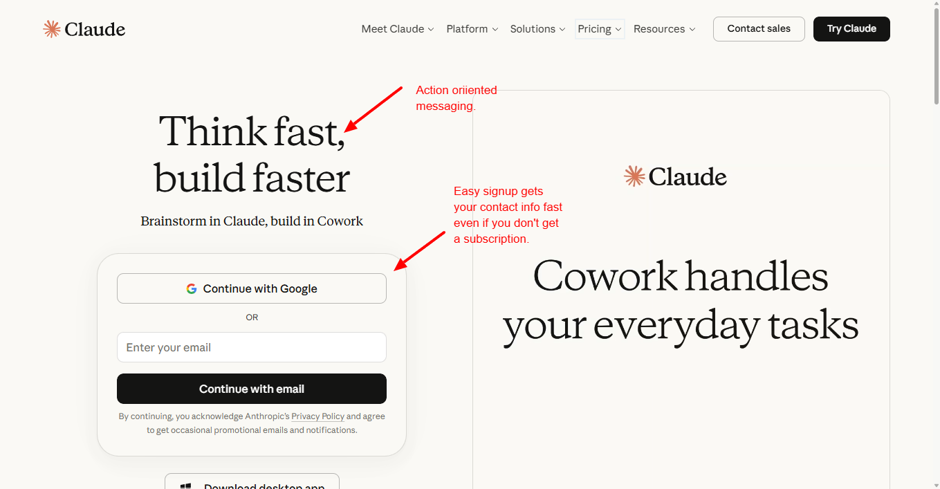
The visual layout does real work too. While visitors are deciding whether to sign up, they can see examples of the platform in action, different use cases displayed right there on screen, giving context without requiring a sales pitch. It communicates range without overwhelming the visitor with a wall of text.
The navigation includes a visible “Try Claude” button, something notably more prominent than anything OpenAI puts in that position. Small detail, significant difference. That button is what conversion professionals call a persistent call to action, and it keeps the next step visible no matter where the visitor’s eye wanders on the page.
Then there’s the pricing section, and this is where Claude earns real points. The three tiers, Free, Pro, and Max, are backed up by plain-language benefit descriptions. “Chat on web.” “Generate code.” “Write and create content.” “Analyze text.” These are things a real person understands immediately, without needing any background knowledge about AI. That kind of clarity is not an accident. It’s the result of someone asking a genuinely important question: would my customer understand this?
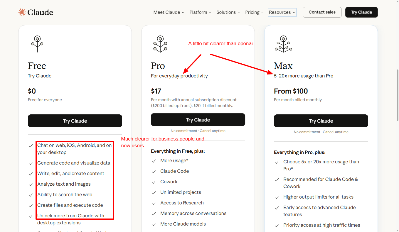 There’s also a structural advantage worth noting. Pricing is accessible by scrolling down the main page, no additional clicks required. Removing that friction matters more than most people realize. Every extra click between a visitor and the information they need is another opportunity for them to lose patience and bail.
Two Strong Brands, Two Different Conversion Philosophies
Taken together, OpenAI and Claude represent two distinct schools of thought in conversion design, and both have real lessons to offer.
The entry point is your most important real estate. OpenAI’s “What can I help with?” prompt is a masterclass in meeting visitors where they are. Rather than forcing them to self-identify as a certain type of user before they even understand the product, it hands them the wheel. For businesses that serve diverse audiences or solve multiple problems, this approach of letting visitors name their own need and then demonstrating a solution is far more powerful than a generic tagline. Think about what this could look like on a service business website, a SaaS product page, or even a consulting firm’s homepage.
Confusion is a conversion killer. Every piece of jargon on a pricing page, every vague feature description, every unclear next step chips away at the visitor’s confidence. OpenAI has the brand equity to survive some confusion. Most businesses don’t. If someone lands on a website and can’t immediately understand what the product does, who it’s for, and what they should do next, they’re gone. Plain language isn’t dumbing things down, it’s respecting your visitor’s time.
Capture interest at the door. Claude’s approach of putting a sign-up prompt front and center, before the visitor has even scrolled, reflects an understanding of how people actually behave on websites. Most visitors won’t make it to the bottom of the page. If the conversion opportunity only exists at the bottom, a significant percentage of interested people will slip away without ever seeing it. The top of the page is where the best real estate lives. Use it accordingly.
Give people a visible next step, always. Whether it’s a button that stays in the navigation, a call-to-action that repeats throughout the page, or a pricing section that doesn’t require three clicks to reach, the path forward should never be something a visitor has to figure out. They shouldn’t have to work to give you their money or their email address. Remove the obstacles.
Benefits over features, every time. “Unlimited access to flagship model GPT-4” is a feature. “Write, research, and create without hitting a wall” is a benefit. The difference is whether the messaging talks about the product or talks about the visitor’s experience of the product. Claude’s pricing descriptions, imperfect as they are, lean toward the visitor’s experience. That’s the direction every business should be moving.
Which Homepage Converts Better?
The answer depends on what kind of conversion is being measured.
If the goal is immediate interaction with the product, OpenAI makes a very strong case. The homepage creates a fast bridge between curiosity and experience, and that is a major strength.
If the goal is making signup, plan comparison, and the next step easier to understand, Claude appears to have the edge. Its structure feels more straightforward, and its messaging places less burden on the visitor.
That is what makes this comparison so useful. It shows that conversion is not one thing. A homepage can be strong at product engagement and still create friction later. Another homepage can be less dynamic at the start but better at guiding people toward commitment.
The real takeaway is not that one company is right and the other is wrong. The takeaway is that every homepage is making tradeoffs, whether intentionally or not.
What Businesses Should Learn From This
There are several practical lessons here, and they apply far beyond AI companies.
Start with the visitor’s problem
One of the biggest strengths in the OpenAI experience is how quickly it connects to the user’s need. That is a reminder that people do not visit websites because they want to read brand language. They visit because they want help. Messaging should meet that reality quickly.
Make the next step obvious
Claude’s homepage reinforces a simple but important principle. Visitors should not have to guess what action to take next. Whether the goal is a signup, demo request, consultation, or purchase, the path should feel clear.
Use language that normal people understand
Pages often lose momentum because they ask too much from the reader. If a visitor has to interpret jargon, decode features, or mentally translate product language into outcomes, friction goes up. Clear language is usually more persuasive than impressive language.
Translate features into outcomes
A feature list has value, but only if the visitor can quickly connect it to real benefits. People do not buy features in isolation. They buy what those features help them accomplish.
Reduce uncertainty wherever possible
Most homepage drop-off is not dramatic. It is quiet. People simply lose confidence, lose clarity, or lose momentum. Strong conversion pages work hard to remove those tiny points of uncertainty before they become exits.
The Biggest Takeaway
If there is one lesson that stands above the rest, it is this: strong homepages make value clear and next steps obvious.
That sounds simple, but a surprising number of websites miss one or both. Some pages explain too much without guiding action. Others push action without making value understandable enough. The best homepages do both.
That is why this comparison is so useful. OpenAI shows the power of fast engagement. Claude shows the value of clarity and reduced friction. Taken together, they offer a strong reminder that conversion is rarely about one clever headline or one attractive button. It is about helping visitors understand, trust, and move.
The Bigger Picture
The Claude and OpenAI homepages offer a fascinating look at how two major technology brands approach the same challenge in very different ways. One gets people into the product fast. The other makes the path toward signup and plan understanding feel smoother. Both have strengths. Both reveal useful strategic choices.
For businesses trying to improve their own websites, the lesson is not to copy either page exactly. The lesson is to look honestly at what a homepage is asking visitors to do, how clearly it explains the value, and whether the next step feels natural.
A website does not need more noise. It needs more clarity.
When visitors understand what is being offered, why it matters, and what to do next, conversion becomes much more likely.
And in the end, that is the real job of a homepage.