So over my 20 years of building websites for lots of companies and a few politicians, I’ve always been captivated by the big presidential campaign. My assumption is that some of the biggest brains in my industry would create the tech and messaging behind their websites.
Of course, people would be able to argue forever why their favorite candidate is better than another, but I tend to believe that how one is more effective than another at communicating is something that would actually be measurable.
So this year, I thought I would compare Kamala vs Trump’s websites to see which one does a better job of passing the Grunt Test.
The Grunt Test: What Is It?
The Grunt Test is something Donald Miller at Storybrand came up with a few years ago. The concept is simple. You have to pretend you are a brand new site visitor, with the simple goal of finding a solution to your problem in just 5 seconds. The Grunt Test measures 3 simple things.
- What do you offer?
- How will it make my life better?
- What do I need to do to get it?
Because of the short time span and the simplicity of the Grunt Test, the goal is to NOT make the person have to dig to find answers to what they want (the problem they want solved). If you make visitors hunt to find a solution to their problem, then the odds of the person taking action become WAY lower, and you lose them as a customer. So given that overview, let’s dive in!
Initial Impression: Those Annoying Popups
FYI, I am going to keep any opinions of the candidates out of this. So if you think I am endorsing one or the other in this post, sorry. Also, I’m going to compare these on the desktop computer … it’s just easier. Also, I imagine these sites change constantly. This review was done on Friday, September 6.
Unfortunately, both of the sites start out with a pop-up asking for money. Uggh. Right out of the gate, this would normally be a no-no (both for SEO reasons and user engagement), but political campaigns are weird, so they can break some of the rules that normally apply to a business.
Kamala’s Popup
Kamala’s popup is easily more elegant than Trump’s and it shows off her pick for VP as well.
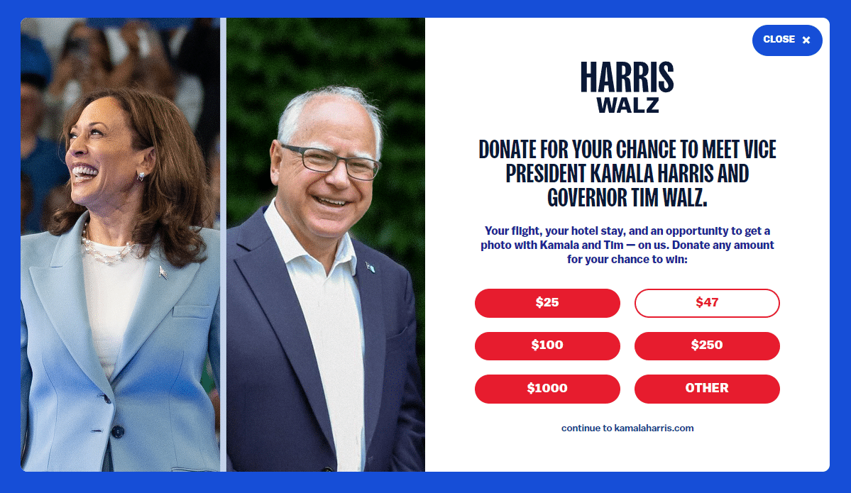
What do you offer: The offer is a chance to meet Kamala Harris and Tim Walz (if you donate) to have your photo taken with them and have your travel expenses paid if you donate any money.
How will it make my life better: It doesn’t say, but maybe it is implied by meeting them.
How to get it: It seems to imply that I can donate money and win a meeting with Harris and Walz. Now of course, I know it is donating to help with their campaign, but it doesn’t actually say that. It simply says give us money, and you have a chance to meet us, nothing about supporting their mission.
Trump’s Popup
So Trump’s popup only has himself and is not styled as elegantly. I wonder if that is on purpose or not. It’s hard to say.
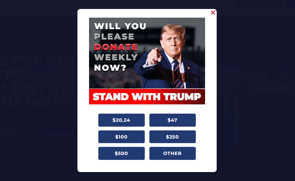
What do you offer: No real offer here unless it is “Stand with Trump”. So it sort of implies the offer is getting Trump as President. It’s not very clear, though, with just the messaging (though we know it is, of course).
How will it make my life better: It doesn’t do any of that here again. Just an implication that donating to Trump’s campaign will help him get elected.
How to get it: Well, again, it isn’t saying what I get, but I can donate. Sure, we all know we are giving money to support a candidate, so the normal rules of business don’t apply, but this popup could be way better with minimal effort.
The Homepage Head-to-Head
So the homepage is really what we want to be comparing and not the popups. You have to be careful with popups for a business or non-profit site, as they disrupt the user experience and have a tendency to throw them off, but if they convert really, really well, then that has to be your call. But use real data to make that decision!
Kamala’s Homepage
Upon entering the site, we are hit with another option to donate, which takes up the top 25% of the page, then their navigation bar, then an image of “Let’s Win This”, followed by a form to Join the Campaign.
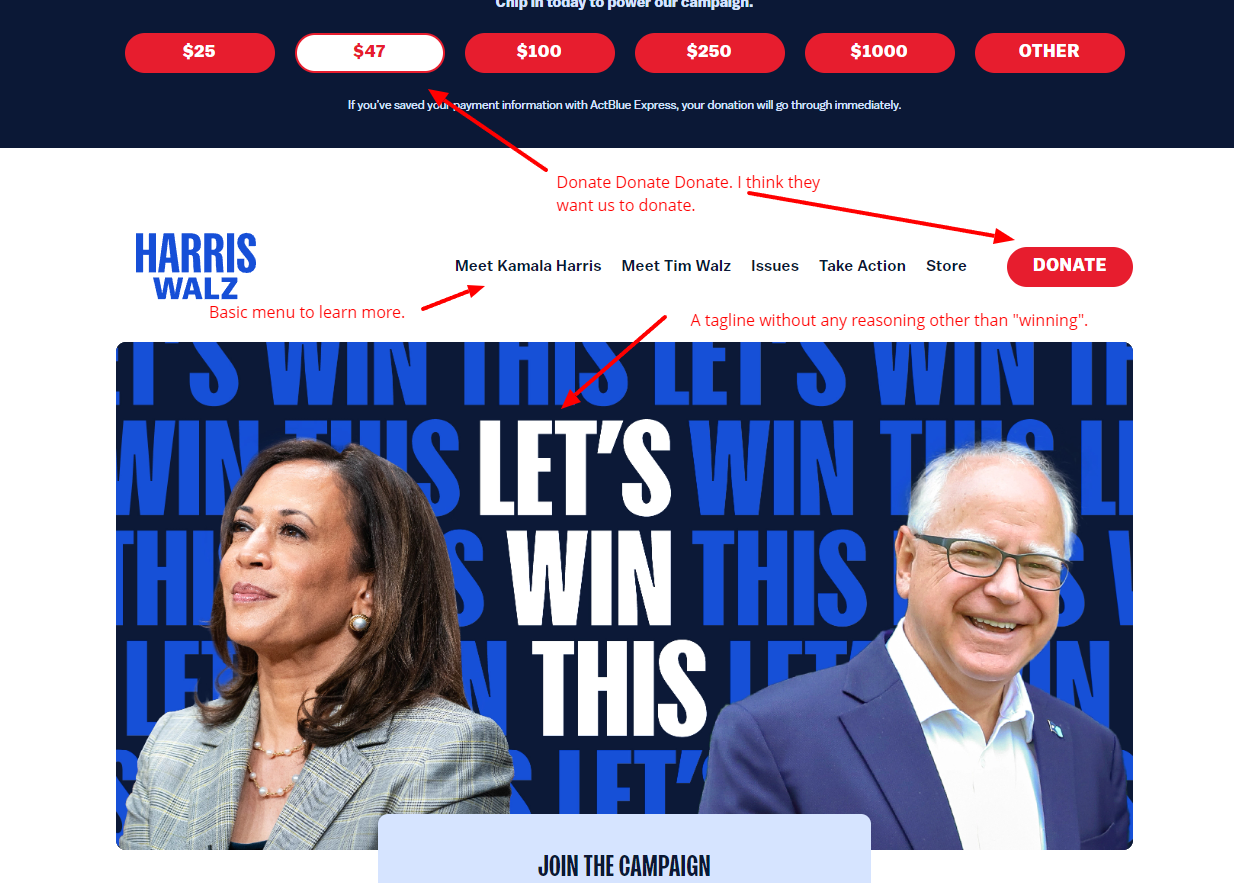
So let’s break it down using the Grunt Test again.
What do you offer: It’s unclear what they want the visitor to do. Let’s Win This is the core message. We know it’s the Presidency, of course, but if we didn’t know who she was or much about her, we would be a little bit at a loss.
How will it make my life better: Nothing here shows what it does for me as a voter on the homepage. I guess I will have to go read some of the internal pages.
How do I get it: It looks like I have to donate or subscribe to an email list. But it’s not clear why I should do anything.
Trump’s Homepage
So Trump’s homepage goes into a lot more detail. It provides the same things for donating and signing up for an email list, but for those who easily want to learn more about the campaign, there are details about what he is committed to, videos, and a place to get merch.
But can it pass the Grunt Test?
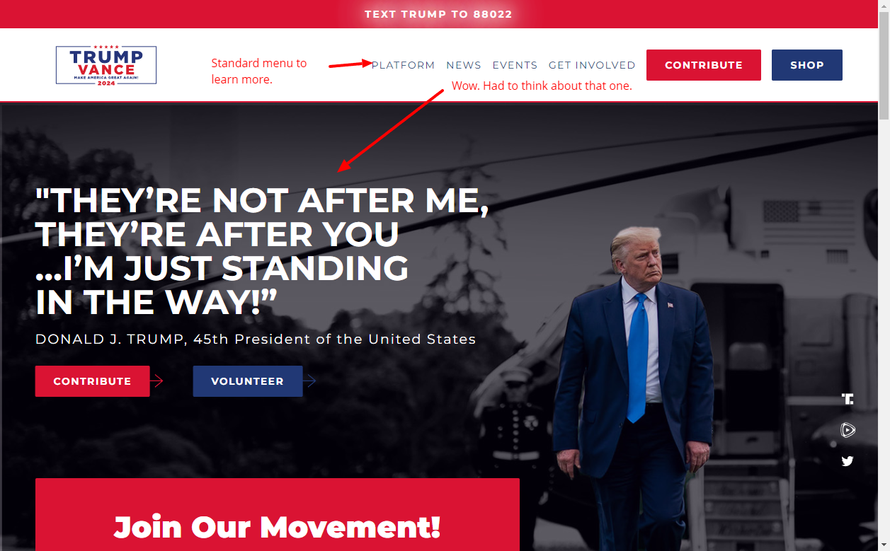
What do you offer: Well, I really had to think about this one. The text says, “They’re not after me, they’re after you… I’m just standing in the way!”. Well, that’s umm, not an offer.
How will it make my life better: Nothing here alludes to making my life better, at least not right away. Remember, the Grunt Test is a 5-second test to capture the heart of your attention.
How do I get it: Assuming I knew the answer to that, then it looks like I can either contribute to the campaign, volunteer, or sign up for an email list. That’s a little bit of an overkill on the number of conversion actions and can lead to decision paralysis.
So Who Wins The Grunt Test?
I would have to say that both of these sites fail the Grunt Test badly. Kamala’s website, it makes me feel like I am just a source of money for them. Trump’s website does a much better job, but it feels more focused on him rather than the voter.
Now, these are political websites that don’t obey the normal rules of digital marketing, so they can get away with things considering their brand awareness. But if either of these sites is looking to sway voters on the fence, then they do a really poor job of it.
So what could they change for the better?
- Focus on connecting with the voter who is on the fence. You already have your core voters, and they aren’t going to change. You need that big group of people who have not made up their minds yet, so change your messaging from getting donations to moving their hearts.
- I have a hard time believing either of these candidates needs more donations. So focus less on converting people into donors, and focus on the people. Get more videos up here that address each of the issues you want people to get behind. Sounds pretty simple to me.
- Lose the popups… right now. They are just annoyances, and again, I doubt more donations at this point are really needed.
These are simple changes they could make, but maybe I just don’t know anything about politics.
But if you take one lesson away from this, focus on your customer’s problems, not your own needs, and it will make your business way more successful.