
Cracker Barrel recently unveiled a redesigned version of its website, an update that reflects a more contemporary visual approach and streamlined interface.
On the surface, the changes seem in line with modern design trends with darker color palettes, simplified navigation, and a more minimal aesthetic. However, as we dig deeper, it becomes clear that while some updates support user experience and conversion goals, others raise important questions about brand alignment, accessibility, and overall usability.
This post breaks down the core elements of the new crackerbarrel.com experience and offers recommendations not only for Cracker Barrel’s team but also for any restaurant or retail brand considering a site refresh of their own. Great digital experiences must do more than look good. They must work seamlessly, support user goals, and reinforce the identity that makes a brand memorable.
The Full Video Breakdown of the New Cracker Barrel Website
Visual Direction: Modern but Misaligned
The most striking difference in the new design is its shift in color and tone. The site now features darker backgrounds, minimalistic typography, and a general sense of polish that suggests modernity. However, in making this shift, the site loses some of the warmth and character that made the original version feel uniquely Cracker Barrel.
Historically, the website used a palette dominated by yellows and textured elements that echoed the in-store experience, such as cozy, friendly, and rooted in tradition. The new design feels cooler, cleaner, and more neutral, which may resonate with younger or design-savvy audiences but risks distancing longtime fans who associate the brand with comfort and nostalgia.
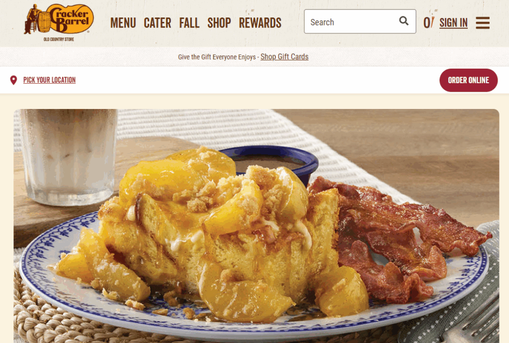
Old Cracker Barrel Design
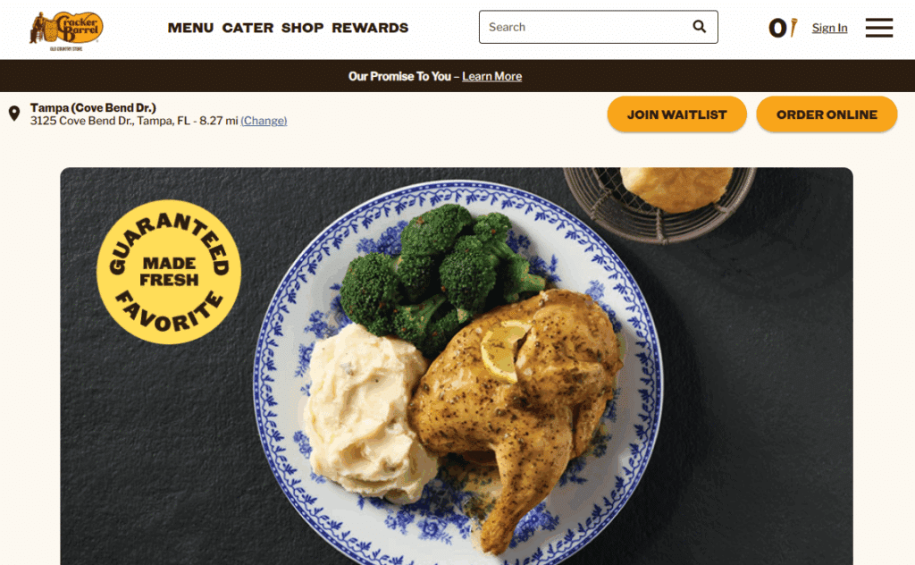
New Cracker Barrel Website Design
Insight:
Visual consistency between physical and digital experiences is essential for brand trust. When a website feels disconnected from the in-person atmosphere, it can create cognitive dissonance that weakens emotional loyalty.
Recommendation:
Consider reintroducing subtle brand cues such as wood grain backgrounds, warm color accents, or illustrated textures that reflect the Cracker Barrel dining experience. These do not need to overwhelm the layout but can be layered in gently to create warmth without sacrificing modern usability.
Navigation Challenges: Form Over Function
Navigation is one of the most critical elements of any restaurant website. Visitors typically arrive with a clear intent, like finding a location, viewing the menu, placing an order, or checking wait times. In the redesigned Cracker Barrel site, the main navigation bar is presented in a dark tone that blends into the page background. While this may align with the aesthetic direction, it introduces a usability issue. Important links become easy to overlook, especially for first-time visitors or older users.
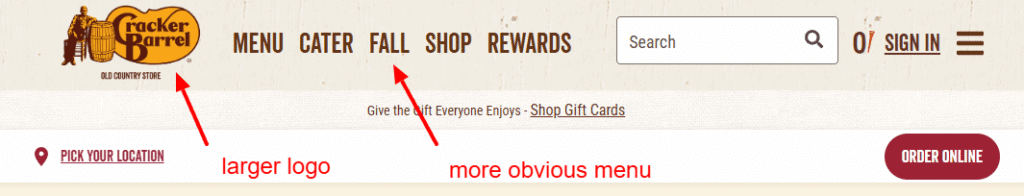
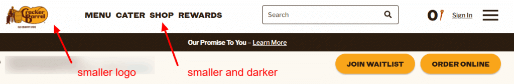
The hamburger menu still exists and performs well, but the fact that many users may bypass the primary navigation altogether indicates a visibility issue that should be addressed.
Insight:
Design should never get in the way of function. When critical navigation elements are difficult to find, even if they are technically present, it creates friction that directly impacts engagement and conversion.
Recommendation:
Increase contrast between the navigation bar and background. Consider increasing font size, adding slight visual separators between links, or using a lighter background strip. On mobile, ensure that navigation items are sized and spaced for easy tapping and visibility in different lighting conditions.
Location Picker: Useful but Cumbersome
The new site includes a ZIP code entry field and location detection tool, which are essential for restaurant chains with multiple locations. However, the experience is not as fluid as it could be. There is no default geolocation detection, and once the location modal is active, exiting or bypassing it is not intuitive. This can cause unnecessary friction for users who simply want to browse or place an order quickly.

This is especially problematic considering that most restaurant websites today automatically detect the user’s location and instantly display the nearest location without requiring manual input.
Insight:
Users expect location tools to be instant and effortless. Any delay or required input creates a point of frustration that may cause the user to leave.
Recommendation:
Implement automatic location detection on first visit, with a fallback option for manual entry. Additionally, ensure that the modal includes a clear close or skip option, and consider displaying location suggestions based on common travel patterns or previous sessions.
Menu Item Placement: A Conversion-Friendly Upgrade
One of the most successful elements of the redesign is the prominent display of menu items on the homepage. Instead of requiring users to navigate several layers into the site, top dishes and categories are now accessible directly from the main interface. This is a major improvement that supports conversion goals by removing unnecessary steps.
Not only does this increase convenience, but it also allows the brand to influence behavior by promoting seasonal dishes, high-margin items, or time-sensitive specials.
Insight:
People eat with their eyes first. Showing food upfront improves desire and reduces hesitation, particularly if the site dynamically adjusts offerings based on time of day or location.
Recommendation:
Continue to highlight bestsellers, but take it a step further by dynamically featuring breakfast items in the morning, lunch deals midday, and dinner options in the evening. Also consider incorporating limited-time offers or rotating promotions in this section to drive urgency.
Mobile Experience: Clean but Needs Refinement
Cracker Barrel’s new site performs well on mobile in terms of layout responsiveness. Fonts scale properly, buttons are easy to interact with, and the site structure holds together. However, some of the design elements that hinder visibility on desktop, such as dark menus or smaller text, are even more pronounced on mobile.
Given that a significant portion of Cracker Barrel’s traffic likely comes from mobile devices, this is an area where small improvements could deliver big results.
Insight:
Mobile design should not be an afterthought. Even subtle usability issues, such as reduced font contrast or hard-to-tap elements, can lead to lost orders and reduced satisfaction.
Recommendation:
Conduct usability testing specifically on mobile devices across multiple operating systems and screen sizes. Look for issues like poor menu visibility, missed taps, or unclear link targets, and adjust accordingly. Improve font contrast and consider using larger tap areas for key calls to action such as “Order Now” and “Find a Location.”
Brand Touches and Iconography: Room for Enrichment
The use of a small barrel icon in the navigation is a nice nod to the brand name and offers a clean, modern feel. However, compared to the rich storytelling of the in-store experience, it feels minimal to the point of underwhelming.
Cracker Barrel’s brand is built on history, charm, and a sense of familiarity. The website should be a reflection of those qualities, even if it adopts modern design practices.
Insight:
Digital branding does not need to be loud to be meaningful, but it should include thoughtful visual elements that reflect the brand’s heritage and personality.
Recommendation:
Introduce additional brand storytelling throughout the site. This could include illustrations, subtle animations, or short content blocks that reflect the experience of dining at Cracker Barrel. Even small touches, like a textured footer, a hand-drawn map, or rotating customer quotes, can help bring the brand to life online.
Final Thoughts: Design Must Serve the Experience
Cracker Barrel’s new website is not a failure, nor is it a complete success. It is a thoughtful update that introduces modern design language, but in doing so, it loses some of the emotional appeal that defined the brand’s digital presence. The core functionality remains intact, and in some places, like menu access and performance, it improves. However, the loss of warmth, the subtle visibility issues, and the underutilization of brand storytelling create a noticeable gap between the site’s potential and its current execution.
This redesign is a reminder that websites do not simply exist to look good. They exist to perform, to connect, and to express brand values in ways that are accessible, intuitive, and emotionally resonant.
Key Takeaways for Restaurant Websites
If you are designing or refreshing a restaurant website, here are a few essential takeaways inspired by this review:
-
Preserve your brand’s personality online with color, tone, and small details that reflect the in-person experience.
-
Ensure navigation is visible and intuitive, especially on mobile devices where space is limited.
-
Make menu items easy to browse and order, ideally from the homepage or one click away.
-
Implement smart location tools that automatically detect or suggest based on user behavior.
-
Prioritize accessibility and readability in color contrast, font size, and tap targets.
-
Use visuals to tell your story, not just to fill space. Your site should feel like your brand, not just a template.
Cracker Barrel’s new site is a strong foundation that, with a few refinements, could serve as a gold standard for how legacy brands can evolve their digital experience without sacrificing what makes them special.