If you do any kind of business online, you know the importance of having a great design that will retain visitors, but did you know that it goes further than just the layout and color schemes? The typography you use for the text on your site has been proven in different studies to have different effects on users. The fonts you choose for your website are just as important as the site design.. It makes a first impression that is either impressive, passive, distasteful or downright boring. To understand the importance of typography, here’s a little more information.
Aiming Content for Users with Short Attention Spans
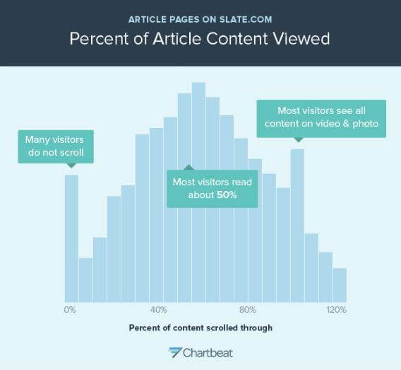
The average Internet user is known for having a short attention span, which is why a lot of people have focused on building blogs and sites with shorter content. This was backed by actual research published in 2008, which was conducted by Jacob Neilson and Harald Weinrich. This study showed that majority of the people scroll only to the halfway point of a Web page that has long content and only stayed on the page to read about 20 percent of its content. Another study performed by Josh Scwartz in October, 2013 indicated that people couldn’t stay focused long enough to read data past the 50 percent mark. This data was used to shape the future of content writing for the Internet, which was geared towards content being between 200 and 1250 words.
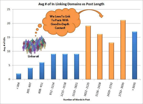
So does this mean that having shorter content on your pages could help your conversion rates? Not exactly. Thanks to another analysis that was performed by Casey Henry from Moz, the content that received the most link backs was longer content. Of course, the industry you’re in and your audience will play a role in determining how much to write for your blog posts, but if it consists of content that is actionable and highly informative, then people can’t resist linking to your content. This in turn may help conversion rates. Here’s a look at Casey Henry’s analysis:
Whether you opt to use short-form or long-form content for your blog, it’s highly important that it be legible and easy on the eyes, which brings us to the next point – typography.
The Connection Between Typography and User Engagement
There’s a debate on which typefaces are the best to use for readability, but first, let’s get into the three factors that should be determined other than choosing the ideal typography:
- The size of the font
- How the lines are spaced
- How old your readers are
Research conducted by Nielson shows that smaller fonts with a low-contrast are the main complaint that readers make when it comes to reading content on the Web.
When it comes to age, the amount of light that reaches into your retina reduces by 50 percent from the age 20 to age 40. Studies from Statistic Brain show that ¾ of Americans wear corrective lenses, which means you need to gear your site’s content to fit users who have perfect and less-than-perfect vision.
Reading speeds, especially by those who have low quality vision, were able to read quicker and comprehend better content that had line spacing that was set to 1.5, according to Psychographics of Reading.
To go even further, research was conducted that showed a connection between typography and the readers’ mood and cognitive performance. This study was performed by Dr. Kevin Larson from Microsoft and Dr. Rosalind Picard from MIT. There were 20 people who participated in the study. Ten people received poor typography and the other ten received good typography.
The group with the good typography was interrupted at the 17 minute mark and was asked how long they were reading. This group underestimated the time they read by 5 minutes and 21 seconds. This goes to show that when content is written in a good format and is relative to the reader, then they will engross themselves into the content – this is what we all want to potentially boost conversion rates.
How to Choose the Best Typography for Boosting Conversion Rates
Although the best typefaces have been argued to be Sans-serif, Verdana and Arial and between 12 pt and 14 pt for body copy, it’s important that you choose based on your particular audience. Here are a couple of tips to help you decide:
- Don’t choose typefaces that are too fancy – stick to those that look good, but are most importantly, readable. Pretty doesn’t always mean better conversions.
- Your typography should complement the text, not overtake it. The typeface shouldn’t be the most memorable part of your content; it should be the message in your content.
- When pairing different typefaces for body copy and headings, make sure that the contrast and correspondence are considered.
- Research your target audience to see which typefaces and font sizes they prefer using at A/B testing.
Typography + User Engagement = Better Conversions
When you’re trying to improve your conversion rates, it’s important that you engage them with your content. When your typography is off, you’ll lose them before they even reach your call-to-action. Keep this in mind as you’re browsing for the best typefaces to use for your blog.