You’ve got a snazzy website with all the bells and whistles money can buy.
It’s pretty to look at and a nice conversation starter at networking events, but it can’t do the one thing you really, really want it to do. SELL.
And it’s driving you nuts why it won’t.
The key to the answer is simple, yet frustratingly difficult.
It boils down to the fact that your audiences have a very short attention span.
Nearly 40% of visitors stop engaging with a website if they do not find the content or layout attractive. Yikes.
This means that your website is having trouble commanding the visitor’s attention all the way to the CTA; they bounce off well before they get to click the button.
But how can you fix this problem?
Why Don’t People Pay Attention?
The human brain is hard-wired trying to keep you alive and pain-free. No matter how far we’ve come with technology, the basic instinct is to “survive and thrive’, as we look for the easiest solution to our problems. So if the info presented to your visitor is unnecessarily confusing, most of us reject it outright.
Simplicity and clarity are always preferred over noise and confusion; no ifs, ands, or buts about it.
Now, let’s apply this logic to your site.
Our previous post regarding the Grunt Test talked about the popular Geico commercial that basically raised the premise that if a caveman were to stumble upon your site, would they scratch their head in confusion or enthusiastically grunt in agreement?
Did you know that users form an opinion about your website in under 50 milliseconds? 0.05 seconds! It seems almost impossible to please visitors, yet countless businesses do it daily. And so can you.
Here’s how.
Liberty Manual: A Website Case Study
Here is an example of the Liberty Mutual Insurance website to see how the Grunt Test works for yourself.
First, let’s take a close look at whether they are able to fulfill the “caveman’s desire” to get home insurance.
(A small note: companies change their websites quite regularly, so don’t be surprised if these aren’t what you find when you search for them.)
The Liberty Mutual Insurance’s website is a great example of how a site meets all the Grunt Test requirements.
- What Do You Offer
- How Does It Make My Life Better
- How Can I Get It Now
If a caveman wants to get the quote on a home insurance policy, he can easily navigate through the process and enter the ZIP code to get a customized quote.
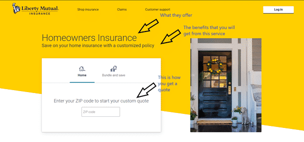
A site visitor can easily determine the reason why this website makes his life easier through Liberty Mutual Insurance’s claim to save him money on home insurance with a customized policy. This makes this site a clear winner!
This is exactly what you want your customers to feel and think when they land on your website.
It should make it easy for them to understand what you offer, how it will benefit them, and the steps they need to take to enjoy your products or services.
An appalling 70% of websites for small businesses do not have a Call To Action on the homepage and landing pages.
Users appreciate a clear path to purchase, even if they don’t do it right away. Not having a CTA on your website is a surefire way to confuse them, so they explore on your website but go and buy someplace else.
With this example, it is clear that to pass the Grunt Test you need to prioritize your audience and how they will perceive your website and interact with it. 38% of visitors will stop engaging if the website they are on is unattractive.
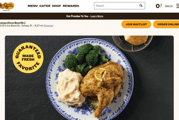
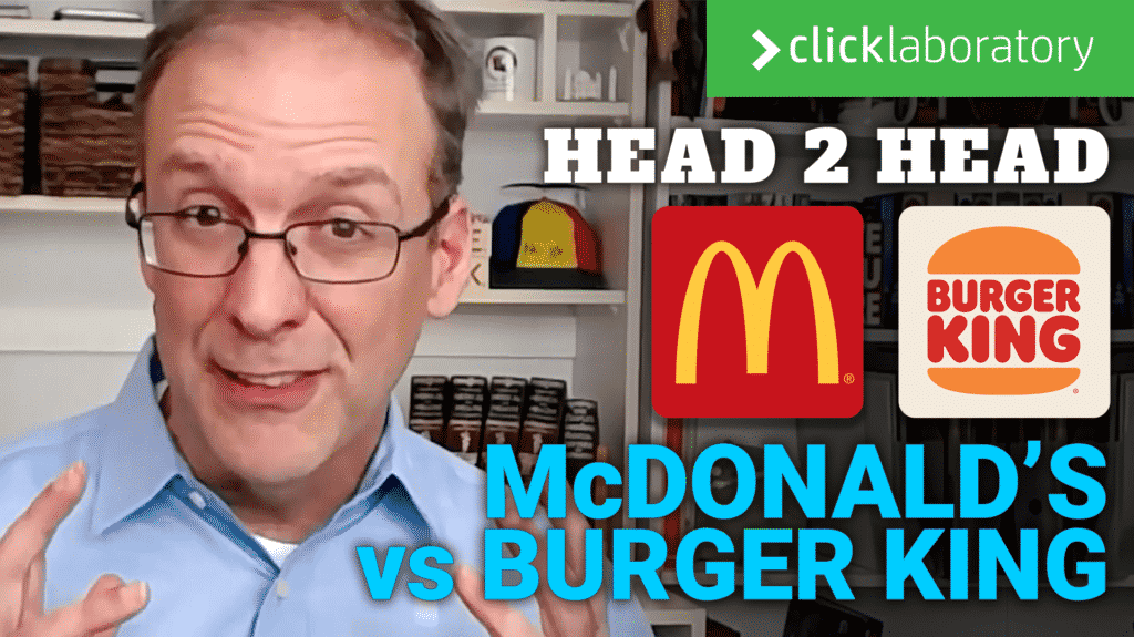
If you want to see more of the Grunt Test in action, here’s a detailed analysis of two fast-food giants: McDonald’s vs. Burger King.
Increase Conversions Using Grunt Test Focused Tips To Simplify Your Website Layout
You won’t pass the test until you have applied changes to your website and you have measured the effectiveness of the change. Check if more people are engaging with your site and converting since you tweaked it.
An easy way to quickly gain information on a lot of different variations is to use A/B testing tools like VWO and Google Optimize.
Once you have a winner, use Google Analytics or your favorite web analytics tool to continue measuring the effectiveness of your homepage.
Tips To Pass the Grunt Test
Here are some tips you should follow to pass the test and get through to the other side.
Tip 1 – Your Tagline Should Be Clear
Research has shown how over 79% of website visitors only skim the text they come across. Thus, having a clear message and keywords that visitors can scan and absorb is crucial. The tagline happens to be the first thing they see, so you need to make it count.
The tagline should be robust, short, and straightforward. To pass the grunt test and boost conversions, you need to let customers know in just a few words either what you do or how you can help in improving their lives.
You may think of a catchy one, but if it isn’t letting your customers know what you do precisely or selling, they won’t be amused.
Tip 2 – Add An Engaging One Liner
In most websites by StoryBrand (aka, the marketing company created by Donald Miller, the brains behind the Grunt test), you will find a one-liner or ‘elevator pitch’ that will come right after your tagline.
If you can create an attractive tagline that hooks visitors to the point that they actually stay and read everything else on the site, you would have hit the jackpot. But, unfortunately, this shows how vital the tagline is, and it is just as tricky.
Most people try to overdo it. They want to include their story and their most significant achievements and let you know how they plan to help you in excessive detail. Remember, even if something is important to you, it may not be for those skimming your site.
You need to slow down the pace and allow them to get a sense of who you are before you dive in. Your online should be focused on your customers and how your business can help them to succeed.
A foolproof formula for writing good one-liners is:
- First, highly the pain-point them led them to your site
- Then, introduce yourself, letting them know how you will be able to help them
- Start teasing them by showing them a small picture of how much their life will improve if they choose to go with your business.
Make sure it is not longer than just a few sentences long.
Tip 3 – Use Bullets And Icons To Highlight Key Information
70% of website visitors only read lists that are in the form of bullets. Checkmarks, bullet points, and icons are excellent graphical elements that can help bring attention to important information within your web copy. You can consider highlighting:
- The services or products you offer
- The benefits your services or products offered
- The aspects that set you apart from your competitors
Tip 4 – Choose A Relevant Image
Okay, sit back and see if this works for you. For example, if I say the word ‘furniture,’ would the first thing that came into your head be a chair? Well, you aren’t alone, as 95% of others would also think of chairs when thinking of furniture.
Prototypicality is a science that happens to work by assigning visuals that typically come into our heads when we think of a thing or concept. So, for example, if we think of construction, you will probably think of a man wearing construction gear. If I said car, you would probably picture a sedan.
Thus, the header image needs to be coherent so that the caveman does not get confused about what your services are and how the picture relates. Also, they should be attractive. It should all come together beautifully.
Take The Grunt Test Now!
Be clear in the way you use your website to communicate with visitors. Then, using this test as a measurement tool, find success without spending an arm and a leg, consult advisors, or cry and give up.
Put yourself in the shoes of your target market, and you will soon be able to get the results you have been looking for. To take our free grunt test, just enter your name, email address, and the URL of the website you want to be tested, and that’s it!