Have you ever wanted insights into what the big-budget marketing teams do to get more customers?
We do!
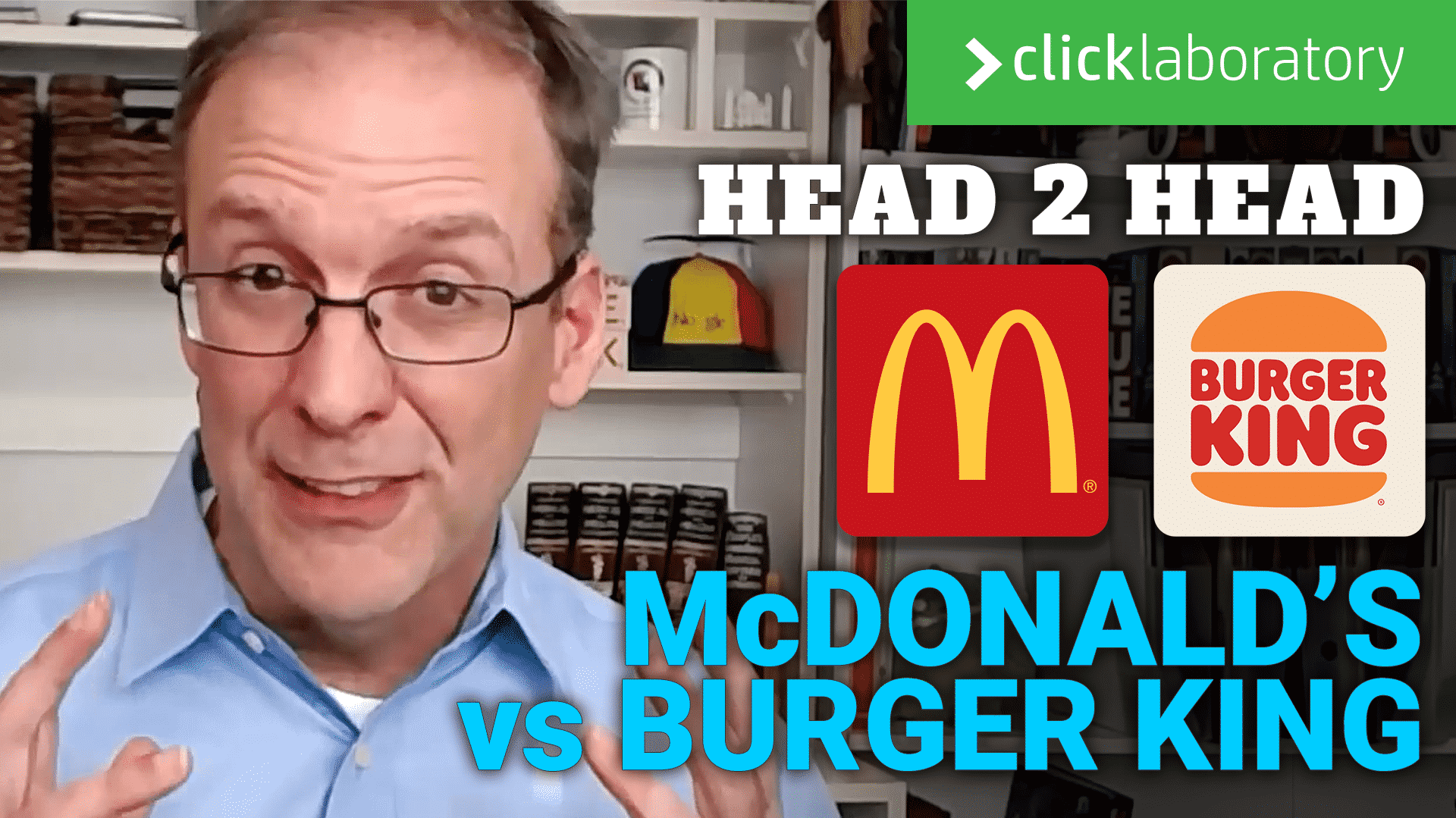
So we have tasked our digital laboratory this month to take a look at who does a better job, McDonald’s or Burger King.
In this head to head, we are going to look at how they do on the Grunt Test, which site performs better, and give our thoughts on which one does a better job at conversion optimization.
THE GRUNT TEST
We are using the Grunt Test to determine how well these two giants communicate with me as a visitor. Do they meet my need, and can I find what I want quickly to make the sale.
Sure, everyone has heard of McDonald’s and Burger King, and truthfully, most of us have probably not visited their website except maybe looking for a coupon, or placing an online order during this Covid season.
So I am visiting both websites assuming I am craving some fast food for lunch as I sit here creating a bunch of funny banner ads for one of my customers.
To review, the Grunt Test is three basic questions that every website must answer within seconds of visiting.
- What do you offer
- How’s it going to make my life better
- What do I need to do to buy it
NOTE: Companies change their sites all the time. Especially the big companies like this, so these screenshots will not be the same if you visit them today.
So both sites have a lot of similarities.
With Covid still being a real pain, a lot of restaurants have gone to online ordering with either delivery or pickup.
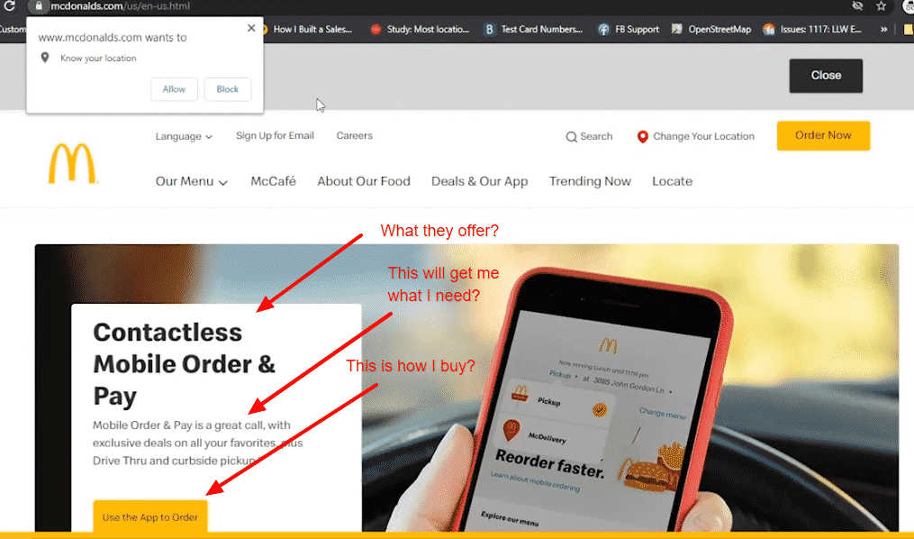
McDonald’s Grunt Test
So if I am ready for lunch, which of these homepages meet my needs? Granted, I do have a preference on which place I like more, but lets assume I don’t have a preference.
If you click on the screenshots above, you can see much more detail.
If I am wanting a burger, McDonalds doesn’t have anything to say on the issue (above the fold). They want me to download their app.
If I dig, I can find an alternate means of ordering lunch on their site, but that’s the point.
I have to poke around to find it.
As a caveman (grunt) I don’t want to think to have to get my food. I am hungry after all, but McD’s is telling me I have to download an app to my phone.
To be brutally honest, I don’t feel like McDonald’s even sells food on their website based on this experience.
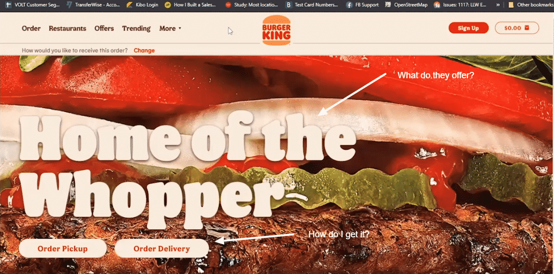
Burger King’s Grunt Test
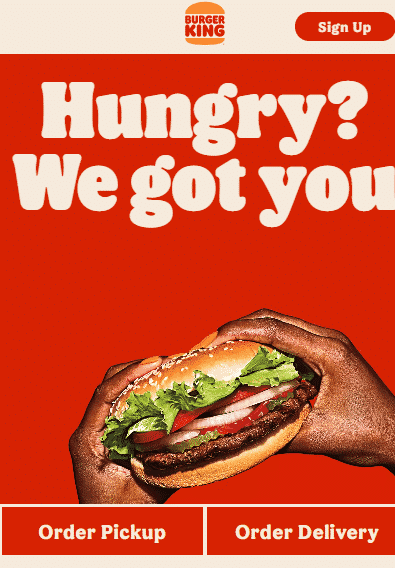
So Burger King, right up front has a great big Whopper taking up my full screen.
They aren’t telling me I have to download an app either, at least not here on the homepage.
So BK has succeeded in showing me a tempting image with a simple way of getting it all within the time it took to load the page.
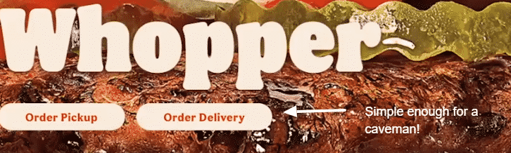
Perfect!
The Grunt Test has been passed!
WINNER OF GRUNT TEST: Burger King Wins hands down.
WEBSITE SPEED AND CORE WEB VITALS
So if you’re in digital marketing you are know Google has been putting a greater emphasis on overall site speed and their core web vitals.
If you haven’t seen these before, check out Google Page Speed and see how your website scores compared to McDonald’s or Burger King scores.
You may be surprised. I know I was.
Google Pagespeed Insights has all sorts of issues, but if we use it more of a template to compare, then everyone is on the same playing field and playing by Google’s rules.
McDonald’s Site Performance
So you can’t judge an entire site by its homepage, but since the homepage is one that most marketing teams pay attention to, I am assuming they have done everything they can to optimize it for consumers.
McDonald’s homepage speed score is 17/100 for mobile devices and 48/100 for desktop.
This had me kind of surprised.
Does McDonald’s assume everyone will simply wait for the page to load because of their brand?
There isn’t so much on the page that it should score this low, but when you look at the Core Web Vitals, it doesn’t seem to warrant those low-speed scores.
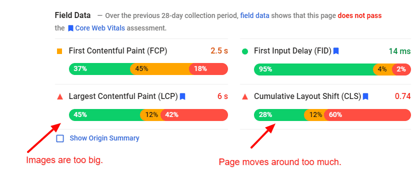
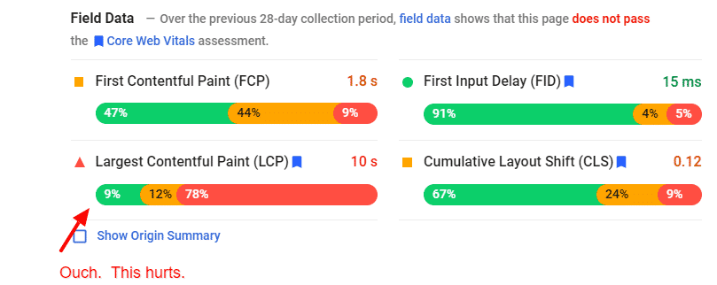
The above screenshot shows the core web vitals for McDonald’s on mobile devices.
This is what is called field data, which means it is what is actually experienced by visitors on their website over the last 30 days or so.
What this really means is that they have a problem with their Largest Content Paint and Cumulative Layout Shift.
These are usually where most websites have their biggest challenges, but they are also pretty easy to overcome.
For McDonald’s they could easily get their LCP into the green by doing a better job of compressing their images to a better size and maybe not using so many images that don’t matter.
The CLS could also be easily improved by making sure the page loads in the layout expected. Several of the components on the screen are moving elements around after they are loaded. If they had better control over what loads, then they could get this one into the green zone.
Overall, McDonald’s is in pretty good shape, but Google is pretty picky.
Burger King’s Site Performance
So BK’s Google site speed scores for mobile are 20/100 for mobile and 28/100 for desktop.
Having visited both sites, I wasn’t surprised to seek BK actually worse than McDonald’s but I still expected a big brand like this to have much much better site speed scores.
Where McDonald’s had mostly issues with their images, Burger King has issues with their Javascript.
There is a lot more going on behind the scenes at Burger King to produce their experience that is have a negative impact on loading time for their visitors.
Javascript is quite a bit harder to optimize than images, unfortunately.
In their case, it may a matter of stripping out what isn’t needed, but that in itself can be extremely challenging to do.
Otherwise, Burger King is well on their way to being in the green for their field numbers.
WINNER of PAGE SPEED: McDonalds
CONVERSION OPTIMIZATION
Here is where things start getting really interesting.
I have to say though, these conversion optimization tips are going to be my recommendations without knowing what goes on internally on the digital teams.
My recommendations here are based on external observations as a visitor that just wants to get lunch. So take that into consideration.
Ideas for McDonald’s Conversion Optimization
So let’s just start out with a screenshot of the homepage.
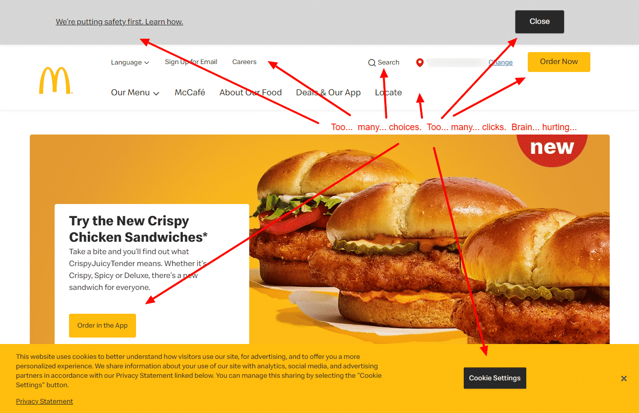
The above is a current screenshot of the website, and you can see the core issue I have immediately.
There are simply too many things trying to get my attention.
This doesn’t even show the popup asking for my location.
I get having to show the Cookie notification, though I think someone in Legal may have gone a little far with the required text.
There are 3 navigation menus to use, competing conversion actions, and a safety-first notification in an ugly grey bar across the top.
This makes me really wonder WHO the homepage is designed for. So much of the above-the-fold content is geared toward legal and safety, I have to wonder if this is less about the food and optimized for something else.
I do love their dropdown menu which shows each of the categories of food. This works great on desktop though it is a little clunky on mobile to find easily.
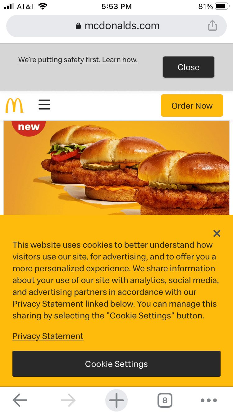
As you can see on the mobile screenshot, the legal notice takes up a ton of room. I understand the requirements and I don’t think there is a marketing person on the planet that wants to have to display these, but surely there is some simplification that could be done.
On the mobile experience, we still have the ugly grey safety bar, but at least the experience is much less busy.
There are 2 main conversion actions that a visitor can take.
- Order Now
- Order In the App
Clicking Order Now from the main menu generates a popup that asks which vendor you want to deliver your products to you. I guess you can’t actually place your order and pick it up.
This is fine, but, to actually place my order, I counted over 8 (I eventually gave up because I had to do too much) steps you have to take to place an order.
Yikes. No fun and not simple. I thought this was supposed to be fast food?
Clicking Order in the App takes me to the page to download the app on desktop and on mobile it fires up the app.
If I ordered food regularly from McDonald’s, using the App would be the way to go, but I just wanted to order lunch right now from my desktop (where I work), and doing that is a big pain and I can’t even pick it up myself (though that service may be somewhere, I just wasn’t presented with the option.
Idea 1: Let customers add to cart on the website everything they need (when they aren’t using an app), then when they are ready to order and have committed to it, then present them with delivery options. They have mentally committed themselves already and may be more willing to go through the headache of delivery options.
Idea 2: If pickup is an option, make it obvious! I never saw this anywhere in my testing. If it isn’t an option, make it one. We want people to check out FAST. Take down as many roadblocks as possible.
Idea 3: Move the Saftey Bar into the content rather than a big ugly grey bar across the top. I can’t imagine that is helping with conversions at all.
Idea 4: If someone is on a menu product page and they click Order Now, I would expect that information to be passed to the delivery vendor so I don’t have to add it a second time. Help me finish my order fast. Don’t make me think about how to use the website, just let me place my order.
Idea 5: Since you can change what is displayed on mobile vs desktop, why not place links to the App store much higher on the page? If someone is visiting from a browser, odds are they don’t have the McDonald’s app, so making it more obvious to download might improve the odds of an order being placed. Maybe?
Ideas for Burger King Conversion Optimization
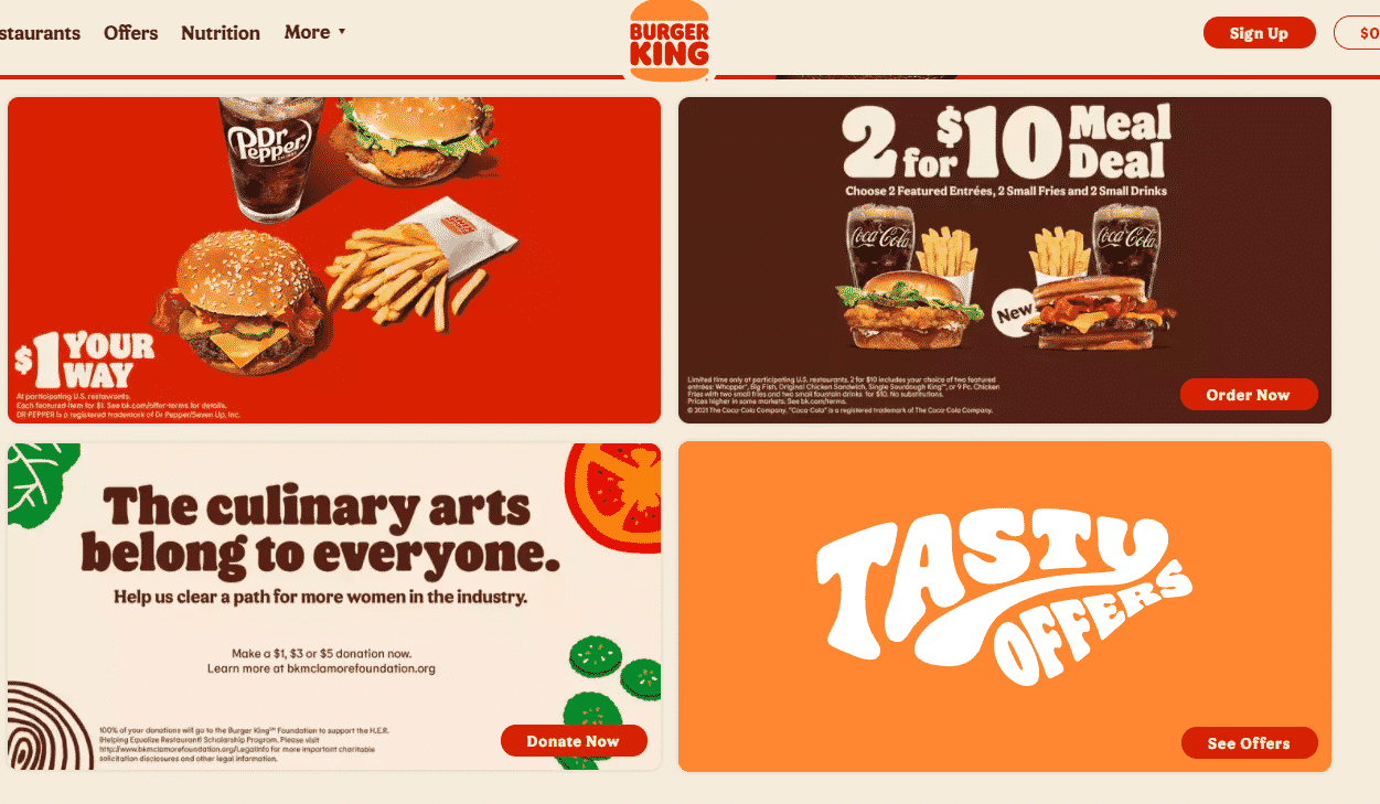
Here is a current screenshot of the Burger King homepage.
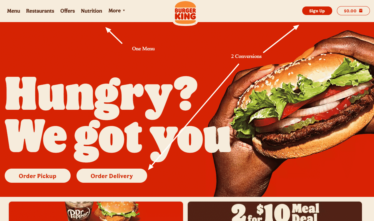
So the BK website is much cleaner. They are very focused on their audience and driving sales with either delivery or pickup.
They combine all of the extra stuff, like careers and such under their More menu.
This clean experience works really well for what is obviously the critical thing for them: orders.
Another thing they do well is showing their available offers right on the homepage.
Let’s face it, people love a deal, and they will use coupons, so why not make them obvious.
The coupons go straight to a page that the coupon is valid for, then once chosen, you pick your location and place your order.
Super simple. Super fast.
I didn’t have to think about what I was doing. Click, click, click done.
The Burger King mobile experience was also very clean and focused on just one task, taking orders.
So if the Burger King conversion experience is strong, are there possible areas of improvement?
Absolutely, but in this case, they’ve covered the important things around placing orders.
Further optimization of the user experience would come best through user testing to find out what works better.
Idea #1: Even though I am only a couple of miles away from a Burger King, I got a message of no delivery options to where I live. When that happens, why not show one of the delivery vendors? I would think that could still be a viable option.
Idea #2: Is there an option for a more personalized experience? Something maybe geographic or demographic that would move me to more likely to convert? I mean, what if I don’t like burgers, but I’m a chicken guy? If I place an order for chicken, maybe show me chicken on the homepage again, but show maybe an upgraded chicken sandwich to try and drive up AOV?
Idea #3: Show reviews, both for products and for locations. Reviews are a major psychological factor that influences whether people buy are not. I couldn’t find any reviews anywhere. And if SEO is important, use Google My Business for each location to capture reviews.
Test
Winner
Grunt Test
Burger King : Clear messaging, didn’t have to think.
Site Performance
McDonald’s : Outscored Burger King, but still needs work.
User Experience
Burger King : Hyper-focused on customers who want to place an order online.
Watch The Full Video Breakdown
Conclusion of McDonald’s vs Burger King Websites
Burger King is a clear winner when it comes to getting my business for lunch, at least if I want a burger.
The experience was cleaner, it was fast enough on my connection (maybe not for Google standards), and they didn’t make me have to think about what I needed to do next.
And there is the key takeaway from this study you should implement on your own site.
Regardless of where people land on your site, but especially the homepage, you don’t want to make your customer to have to figure out what to do next.
Make that customer journey as simple as possible and you will get more sales.