Of course, we are not talking about improving headers in Soccer, but your landing page header that a visitor sees when they first enter your site.
We’ve talked extensively about how important the Grunt Test is here at Click Laboratory and on our social channels for improving the odds of someone staying on your website.
If your website visitor can’t envision you solving their need (really fast), then you have no chance of engaging with them and turning them into a customer of any kind. That problem may be a solution to their problem or simply something to entertain them. Either way, you have to engage and connect with them quickly.
The header of your landing page (homepage, campaign, product page, wherever someone lands first on your site) is the first and maybe most important part of your engagement optimization strategy.
So lets zoom out a little bit past the Grunt Test and look at your entire header.
The Landing Page Header Breakdown
Creating an amazing header for a website landing page is crucial as it’s often the first thing visitors see and can significantly influence their first impression.
There are several components of a header for current websites that a customer can see. This pertains to both the desktop browser and the mobile visitor. The mobile visit is going to be more challenging since you have a lot less space to work with and people’s attention span is even shorter.
What can be included in the header?
- Logo
- Menu
- Search
- Contact Information
- Primary Message
- Secondary Message
- Conversion Action (or two)
- Background image or video
That is a LOT of things for a person to pay attention to within a few seconds. Because pretty much every buyer these days has been using the Internet for a long time, they have learned to automatically tune elements out. So even though you have to have all of these elements (usually) only a few are most important.
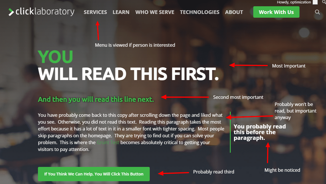
Here is an example from our own homepage.
Adjusting Your Landing Page Header Based on Customer Research
Changing your landing page header based on audience research involves tailoring the design, content, and functionality to meet the specific needs, preferences, and behaviors of your target audience. Here’s how you can effectively make these changes:
1. Reflect Audience Preferences in Design
Color Scheme and Imagery: If your research indicates a preference for certain colors or imagery among your target audience, incorporate these into your header. For instance, a younger audience might prefer vibrant colors and dynamic images, while a more professional audience might appreciate a cleaner, more minimalist look.
Cultural Relevance: Ensure the design resonates with the cultural context of your audience. This could involve using specific cultural symbols or design motifs.
2. Adjust the Messaging
Tone and Language: Align the tone and language of your header’s text with your audience’s expectations. A tech-savvy audience might appreciate jargon or industry-specific terms, while a general audience would need simpler, more accessible language.
Value Proposition: Highlight benefits and features that are most appealing to your target audience. If your research shows that your audience values cost-effectiveness, emphasize affordability in your messaging.
Optimizing the Header for Improved Engagement
Using a Clear and Engaging Call to Action (CTA)
A visibly prominent CTA is the cornerstone of your header. Place it in the top right corner, using bold, contrasting colors to make it stand out. The language should create a sense of urgency (e.g., “Limited Offer”) or incentive (e.g., “Sign Up and Get 10% Off”).
The CTA should be concise but powerful, clearly indicating the action you want users to take. Consider using action-oriented words like “Discover,” “Start,” or “Join” to encourage clicks.
Creating a Compelling Headline and Messages
Your header should feature a concise, engaging headline, and sometimes a sub-headline that immediately communicates your unique value or solution for the visitor.
This headline should succinctly describe what you offer and its benefits, using language that resonates with your target audience.
For example, if you’re targeting professionals, use sophisticated, industry-specific language, whereas a more general audience might prefer simpler, more direct phrasing. The headline should align with the overall tone of your brand and set the stage for the user experience on the rest of the page.
Let’s look at a horrible example of this. Can you tell me what the compelling headline of this site is?
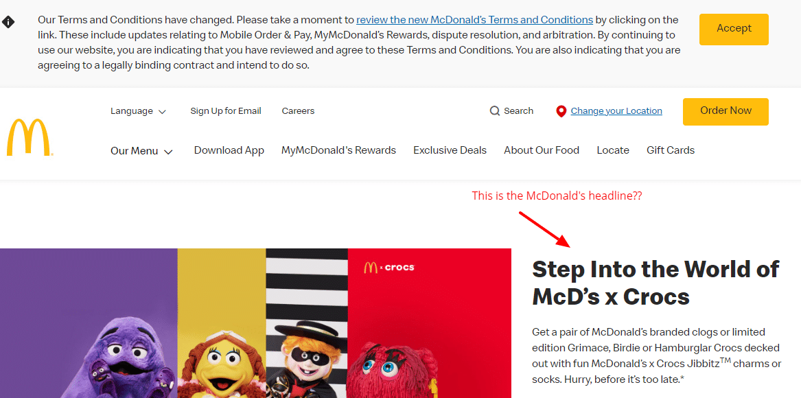
So that is McDonalds.com homepage at the time of writing this. We did a previous review of McDonalds vs Burger King homepages and it seems like things have only gotten worse. I’m totally unsure what to do, but I didn’t come to McDs to buy crocs, but it seems like I am in the wrong place if I wanted to find one near me or place an order. Total turn off.
Simplified Navigation
Simple and intuitive navigation helps users find what they’re looking for without confusion. Limit the number of menu items to avoid overwhelming your visitors.
Use dropdown menus to organize content into categories if necessary. Highlighting key pages like “Products,” “Pricing,” or “Contact Us” can direct users towards taking action.
Ensure that the navigation menu is clearly labeled and easy to use across all devices, particularly on mobile.
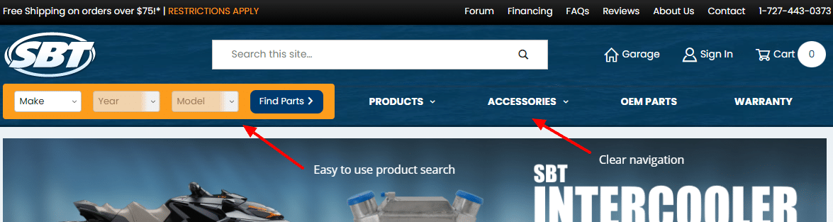
Here is a solid use of the header space for navigating content on ShopSBT.com. It meets the needs of people who like browsing, as well as those who prefer searching, all in a compact and easy to use interface.
Visual Appeal
Incorporating high-quality visuals can significantly enhance the appeal of your header. Choose images or videos that reflect your brand and resonate with your target audience.
For example, if your brand is playful and youthful, vibrant and dynamic images can be effective. Remember to balance visuals with your textual content – the imagery should complement, not overpower, your message.
Also, ensure that these visual elements are optimized for fast loading to maintain a smooth user experience.
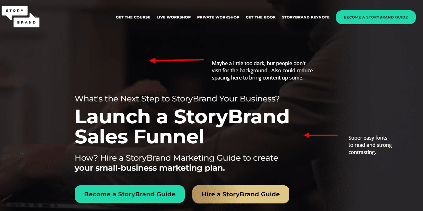
Storybrand.com is one of the most trusted brands for helping companies craft their messages. So why look any further? They use video on desktop and a static image on mobile (for speed purposes). But their visuals are dark and behind the scenes so that the message and conversion action is the primary visual itself.
Building Trust
Incorporate elements in your header that build trust with visitors. This can include displaying client testimonials, user reviews, trust badges, or any awards and recognitions your company has received.
If you have notable clients or partners, featuring their logos can enhance your credibility.
These trust signals reassure users of your legitimacy and quality, making them more likely to convert.
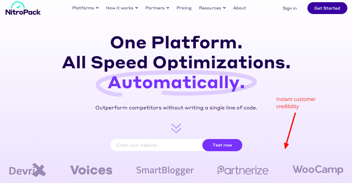
Nitropack.io is a tool for speeding up websites and being credible is extremely important. Their homepage is almost dedicated to creating trust for visitors right away from their wording to their customer list in the header.
Optimized Loading Speed
A fast-loading website is essential for keeping users engaged. Many companies end up using unoptimized images or videos thinking they look great, which they may, but they are so big that they impact the engagement of the visitor.
Optimize images, and use lightweight fonts and minimal scripts to ensure your header loads quickly. Slow loading times can lead to increased bounce rates as users might leave the site if it doesn’t load promptly.
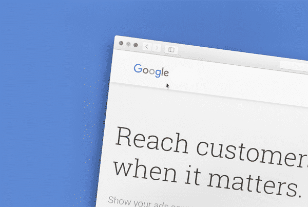
Tools like Google’s PageSpeed Insights can be used to check your header’s loading speed and get suggestions for improvement.
Personalization
Personalizing the header can significantly enhance user engagement. Dynamic content that changes based on user behavior or demographics can make the header more relevant and appealing.
For instance, you could display a different greeting or offer based on the time of day or the user’s location. Personalization makes users feel valued and increases the likelihood of conversion.
Test and Iterate Your Landing Page Headers
Before diving into A/B testing your headers, it’s crucial to clearly define what you aim to achieve. This could be increasing engagement, enhancing engagement rates, or boosting conversions. Your objective will guide the entire testing process, influencing which elements of the header you should focus on.
Creating Header Variations
Once your objective is set, the next step is to create variations of your header. Differences could include changes in the headline, call-to-action (CTA) design and text, imagery, or layout. It’s essential that these variations are distinct enough to impact user behavior but still maintain a degree of similarity for effective comparison.
Utilizing A/B Testing Tools
To implement the test, use A/B testing tools such as Optimizely or VWO. These platforms allow you to show different header versions to varied audience segments and track their performance. They provide valuable data that can be analyzed to determine which version is more effective.
Divide your audience randomly to ensure each group is statistically similar. This segmentation ensures that any differences in performance are attributable to the header changes rather than external factors. Each segment should experience a different header version for a reliable comparison.
Launch the test and let it run for a sufficient period. The duration will depend on your website’s traffic volume; you need enough data for statistically significant results. Avoid running the test during atypical periods (like holidays) where unusual traffic patterns might skew the results.
Analyzing and Using Results
Use analytics to measure how each header version performs. Focus on metrics that align with your initial objectives, such as conversion rates, click-through rates, or bounce rates. This analysis will reveal which header version most effectively meets your goals.
Based on the test outcomes, determine which header is the most successful in achieving your objectives. If there’s a clear winner, implement it on your landing page. If the results are inconclusive, you might need to run additional tests or experiment with different elements.
Once you’ve identified the most effective header, implement it on your landing page. It’s important to continuously monitor its performance to ensure it consistently meets your goals over time.
A/B testing is not a one-time task but an ongoing process. Regular testing and optimization of different elements are key to continually improving user experience and conversion rates.
Some Final Thoughts
Your header is a critical component to capture the attention of your visitor. It isn’t the only one, but if you can’t get people past that point, you will not convert them.
A/B testing the header of your landing page is a powerful strategy for optimizing visitor engagement and conversion. By systematically testing and analyzing different versions, you gain insights that guide you in making data-driven decisions.
This process not only enhances the effectiveness of your landing page but also fosters a culture of continuous improvement and innovation in your web design and marketing endeavors. Remember, the digital landscape is ever-evolving, and regular A/B testing ensures your landing page remains effective and relevant.